I do love a good graph
By martha

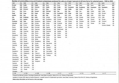
This one, courtesy of the Leopold Center for Sustainable Agriculture at Iowa State, shows the number of crops and livestock produced for sale on one percent of Iowa farms between the years 1920 (far left column) and 2002 (far right).
Kurt Meine passed it around the other night as part of his apple talk. For a full-size view — in which you can actually read the words — go here. But, even at this illegible perspective, the drastic decline in diversity comes through loud and clear.
In 1920 84% of Iowa farms (as we’re supposed to extrapolate from the one- percent sample) produced apples; in 1935, 56%; in 1945, 41%. Nine years later, in 1954, it’s down to 5%. By 1964 apples are grown by just 2% of Iowa farms, and by 1978 they’ve fallen off the chart all together.
What remains? No big surprise there: Corn. Soy. Hay. Cattle.
What does it mean? Still working on that part.
Very cool – but what’s timothy?
PS – put in my tomatoes today. Squash are sprouting, turnips and kohl rabi too. I have no clue what to do with anything but the squash, but this is part of the adventure.
Worm bin has arrived, worms on order.
XO KP
I think it’s a kind of hay?
I fear my worms have died. They are not very wiggly. And most of them seem to be hiding. But my worm guru says to give it a while longer before panicking.
My worms are in the mail. Hope yours are OK. I would think apartment life would be pretty benign — I’m sure they’re just taking a personal day.